Blog
Summer Colours - A Trend Forecast
Summer Colours - A Trend Forecast
Winter feels like a distant memory at this point and as the days continue to grow warmer, its time to gear up for a new season. Apart from soaking up some Vitamin D during day and stargazing at night, here are some colour trends that will prove why we are so smitten about this season of summer.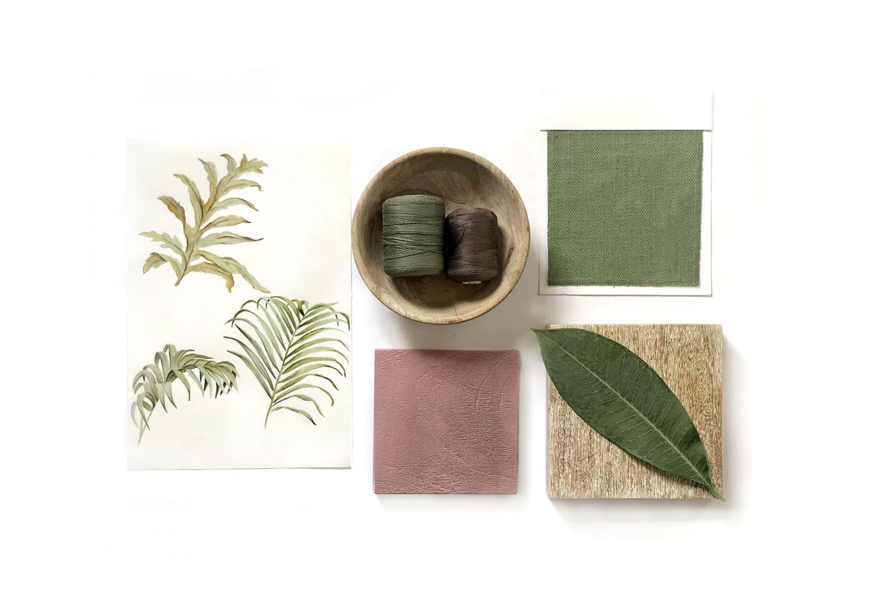
THE SUNSHINE PALETTE
A sofa or a rug in the hues of sunshine (mellow & golden yellows) instantly becomes a showstopper in your interiors. These colours form an unbeatable duo with dynamic structures or materials; for example, a viscose rug or a shaggy rug makes golden yellow shine. Shades of yellow can quickly become tiring, which is why you should rather leave them out of the bedroom or a relaxation room. Together with the right pieces of furniture, the vintage look of the 1970s is guaranteed with this palette!
1. PANTONE 12-0742 TCX - LEMON VERBENA
Brightening the day and uplifting the mood, Lemon Verbena is light, sunny and zesty, making it a playful addition in your home. To add a ray of cheer to your living room you can start subtly with accessories, cushions and throws, artworks or perhaps a small accent chair, but if you want to go all out on the sunshine theme, paint a large accent wall in this vibrant shade or even have your sofa reupholstered. No matter the application, neutralize this energetic hue with timeless and evergreen neutrals (white, gray, earthy brown).
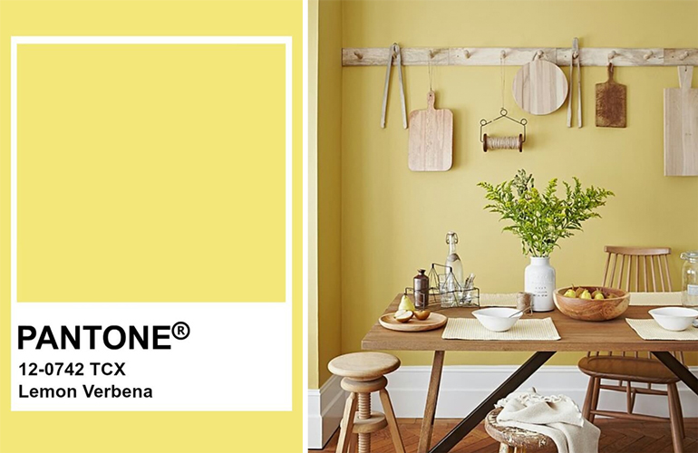
Image Credits: Instagram@Creativedesignseeds
2. PANTONE 15-0960 TCX - MANGO MOJITO
Feeding our need for pleasant comforts, Mango Mojito offers plenty of colour inspiration and is perfect for adding warmth and energy to a space. This colour can be fun to just saturate the room with an orange glow. Layer in yellows, golds, copper, brass and rich dark woods and watch the hue casting it spell!
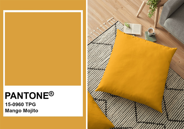
Image Credits: Redbubble
THE ROMANTIC PALETTE
Eclectic hues with softened mistiness and haze, this moody palette shares great compatibility with other shades. Fitting in the trend of choosing more optimistic and hopeful colours for 2019 these soft hues are as refreshing as the summer sorbet treats. Bring in their bold complementary counterparts or pair with neutrals or stronger oranges and pinks (with the same undertones) for a vibrant yet livable palette.
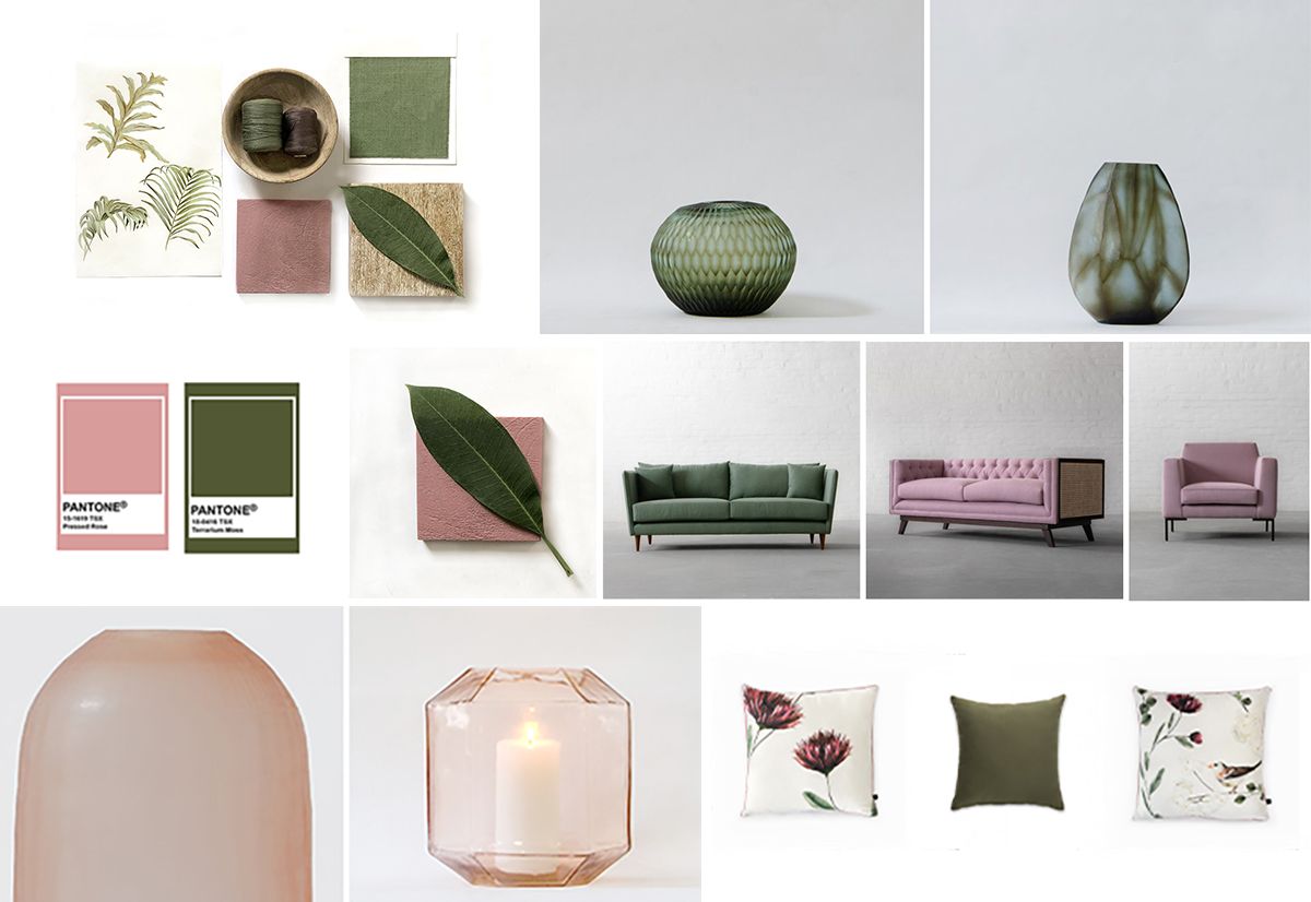
3. PANTONE 15-1619 TSX - PRESSED ROSE
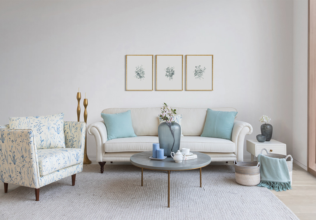
The blushing Pressed Rose will fill you with thoughts of romance, sentiments and love. Its easy and gentle manner can add a charming aura to any setting, modern or traditional. While this hue will pop right out on printed upholstery, its muted companion will act as a great neutral for your walls. If you are looking to add some colour but hesitant in the boldness it will bring along, we suggest that you go for pressed rose, as this shade perfectly camouflages as a new-age neutral.
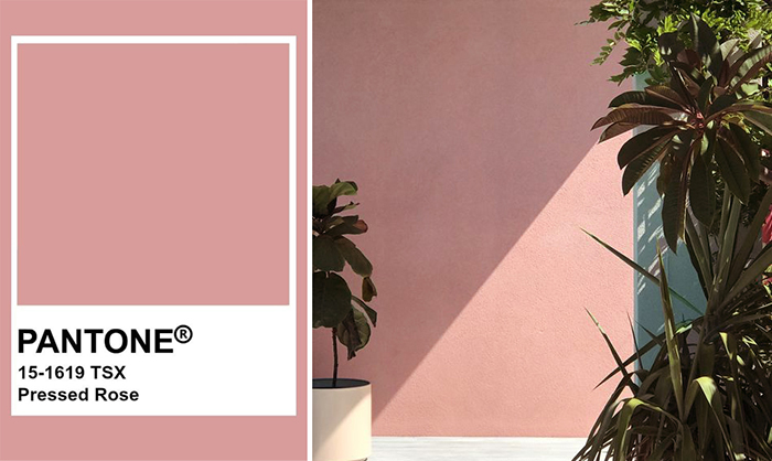
Image Credits: Pinterest#Jen Farr
4. PANTONE 16-1546 TCX - LIVING CORAL
It only makes sense for the pantone of the year, Living Coral, to be on your radar when you begin your summer home revamp. An affable and animating shade, whose golden undertone gives it a softer edge, this shade adds an element of fun and modern flair to your interiors.
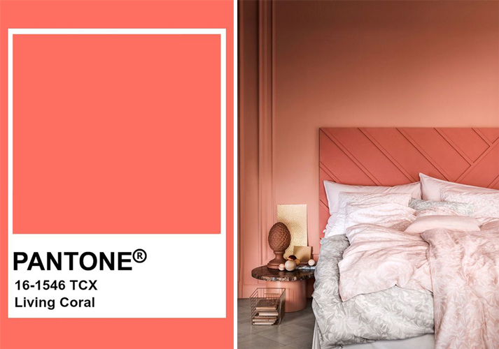
Image Credits: Sfgirlbybay
THE NATURE’S PALETTE
This season features earthy nuances that look wonderful against natural textiles such as sisal and cotton, also with textures such as velvet, reminding us of the beauty of nature. Grey, natural white, terracotta tones and ethnic patterns as well as wooden furniture become cool companions with green on hot summer days.
5. PANTONE 17-0542 TSX - PEPPER STEM
The Zesty yellow-green Pepper Stem hue will encourage your desire for nature’s healthy bounty. What we also love about this colour is how seamlessly it can transition between walls, furniture and accessories. Its gender neutrality also holds a special place, perfectly balancing the masculine and the feminine in the décor.
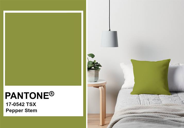
Image Credits: Redbubble
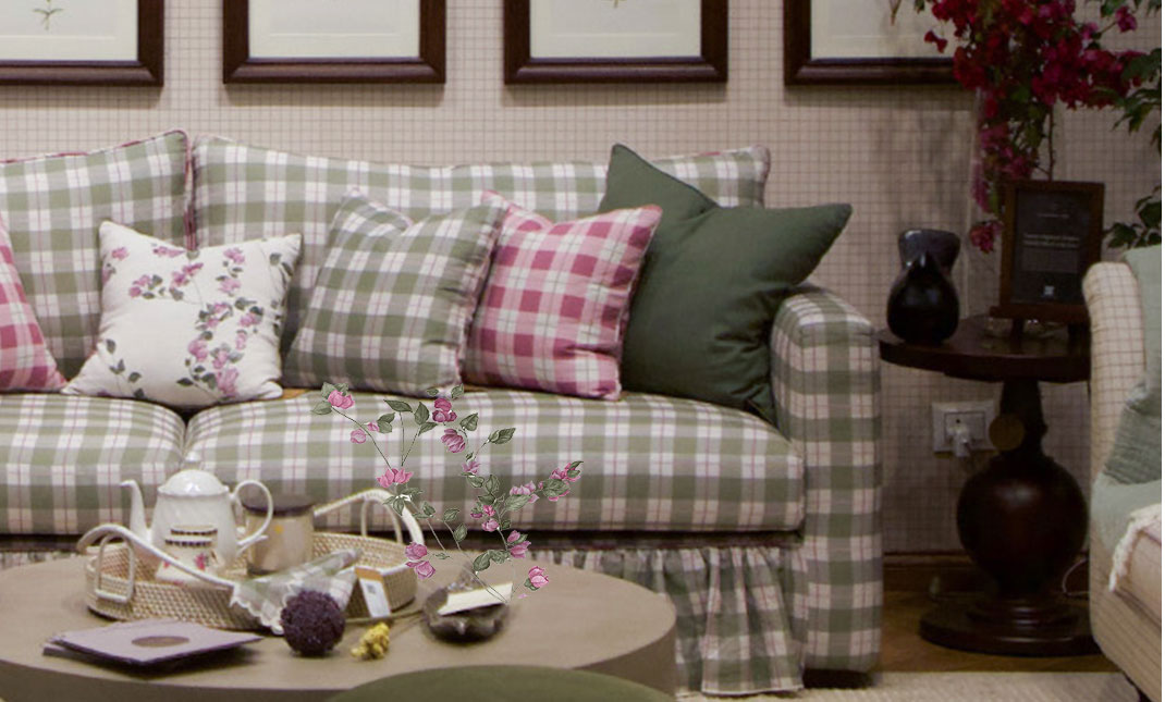
6. PANTONE 18-0416 TSX - TERRARIUM MOSS
Terrarium Moss is reminiscent of our outdoor world, of the flourishing foliage and represents the physical beauty of the plants and the wilderness around. It is timeless in every respect and works beautifully with natural elements and neutral tones. Paint an entire wall for a dramatic effect or add some indoor plants for a subtle application of this celebrated colour.
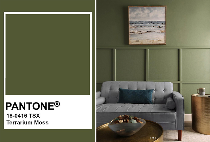
Image Credits: Instagram#ThisOldHouse
THE BOLD PALETTE
Fundamental, basic and everlasting, while at the same time, elegant and forever fashionable, the bold palette is saturated without being overwhelming. Infusing life into a space, these colours encompass comforting and cozy qualities, while bringing in sophistication with their rich and deep tones.
7. PANTONE 19-1862 TCX - JESTER RED
Adding depth and intensity, Jester Red combines rich elegance with urbanity. As bold and captivating as it might be, this colour needs to be used carefully and if done right it can mix well with almost any décor scheme while evoking some cozy, insular vibes of a vintage fashioned space.
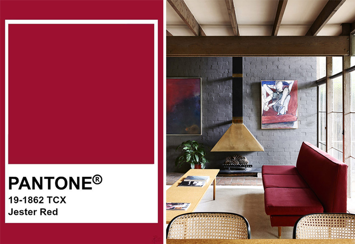
Image Credits: Plastolux
8. PANTONE 18-1031 TCX - TOFFEE
Deliciously irresistible, tasteful Toffee whets the appetite. If the above pantones are too flashy for your style, this diverse nuance may be your absolute favourite. Revealing a sense of sophistication wrapped in a relax mood, this hue is easy to incorporate and can mould into any personality. While an upholstered leather sofa/ armchair in this colour is always a good choice, try adding some accessories in this shade to experience its all-new avatar.
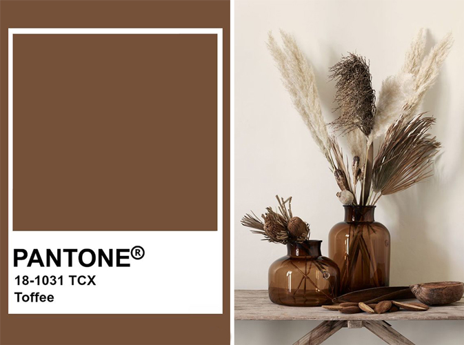
Image Credits: hm
The highlights from our pick of trendy summer colours will definitely be ‘Pressed Rose’ and ‘Terrarium Moss’. We love these complementary colours for two completely different reasons, while pressed rose will act as a calming pop of colour, terrarium moss will always be timeless and glamorous.
The Summer of 2019 is taking a more mindful, lifestyle-based inspiration for interior colours, from earthy greens to soft terracottas and blush pinks, this season is about connecting the dots between our lives at home, our intellectual demands and our digital engagement. Rather than going with the obvious, incorporate these offbeat hues and let your interiors shine through.
 Categories
-

-
 April 18th, 2026
 -
 April 11th, 2026
 -
 April 9th, 2026
 -
A Season in Bloom: Introducing the Summer Bougainvilleas Collection
March 23rd, 2026