Blog
A New Phase - Illuminating and Ultimate Gray Pantone Colors 2021
There is always extensive study based on trends behind Pantone’s choice. Still, due to the present pandemic that has perturbed the entire world, there’s a need to sense that there’s more to it, that everything will get brighter at the end of the tunnel. That’s what Illuminating and Ultimate Gray are all about.
Illuminating is presented as a vibrant yellow that reminds us of delight, verve, and sunshine, while Ultimate Gray is a neutral, that reminds us of eternal basics and balance.
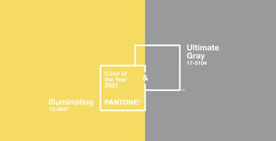
Image Credits: Pinterest
“The selection of two independent colors highlight how different elements come together to express a message of strength and hopefulness that is both enduring and uplifting, conveying the idea that it’s not about one color or one person, it’s about more than one," said Leatrice Eiseman, executive director of the Pantone Color Institute, in a statement
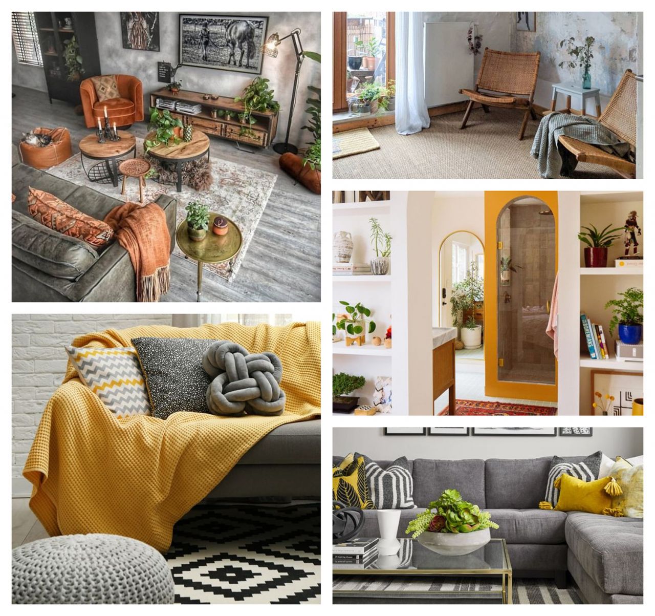
Nostalgia obsessed interior trends have been around for a while. The focus is on the lounge, where we gather and spend most of the quality time now that our travels and congregations outside are limited. We feel drawn to the optimistic energy and the spirit of these colors and its shades as we associate them with hope, ideals and safety. Let’s journey in to ways and update your abode with dashes of grey and yellow to be right on trend and find the perfect look for your home.
Look#1 Elegant & Cheery
Yellow is seen as playful color while gray will add the elegance!
This shade of yellow is very bright, cheerful, and energizing. And, because of its boldness, it can effortlessly take over a room. So, always balance it with subdued and basic hue. Gray will add a sophisticated edge to the overall look of your space... (Though, you could also pair it with black or brown, or navy blue which would also offer that grounding element too)
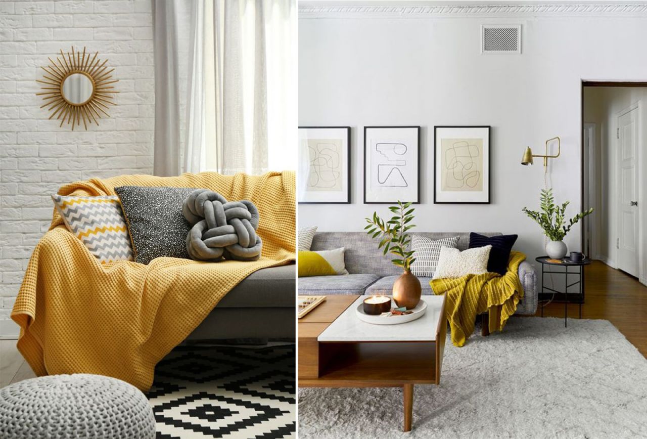
Image Credits: Pinterest | Pinterest
Look#2 Bold & Moody
Capture the energy of illuminating color throughout your architecture, while using it in a small area of the room.
Painting an archway or adding a cushion or wall-art or even an accent chair is a fun way to bring in a bright and bold pigment that you may not want to commit to on a larger piece. The overall vibe of your space will turn into fun and moody, with the bold patterns and pop of yellow bringing energy and color throughout a gray/white or a neutral backdrop.
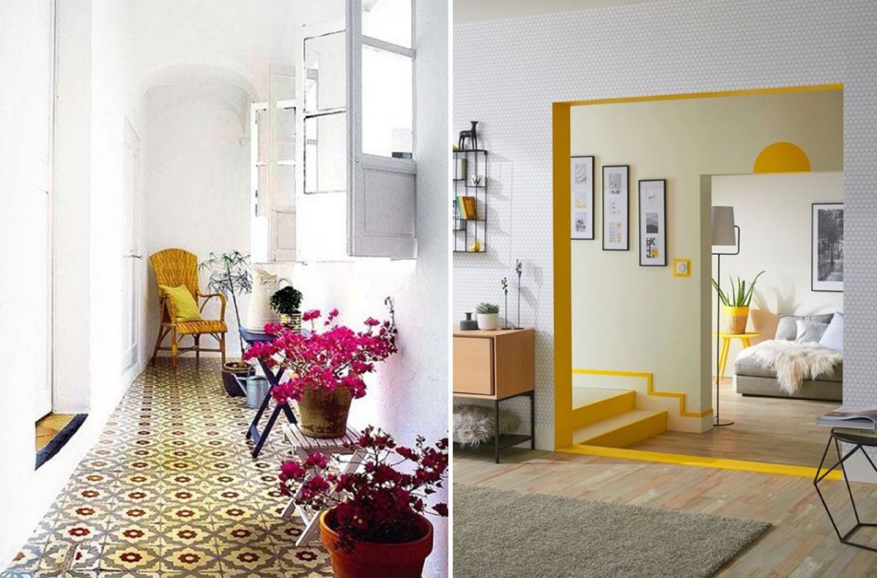
Image Credits: Pinterest | Pinterest
Look#3 High-Contrast & Curated
Elevate shades of blue, teal, green and pair with the Pantone colors for a curated look.
Sometimes design was all about creating contrast. A warm mustard sofa helps to offset the dominant cool tones of the wall color. By layering a space with art, objects, and furniture, explore a curated take on the Minimalist Maximalist style, but with a renewed and unpredicted color palette.
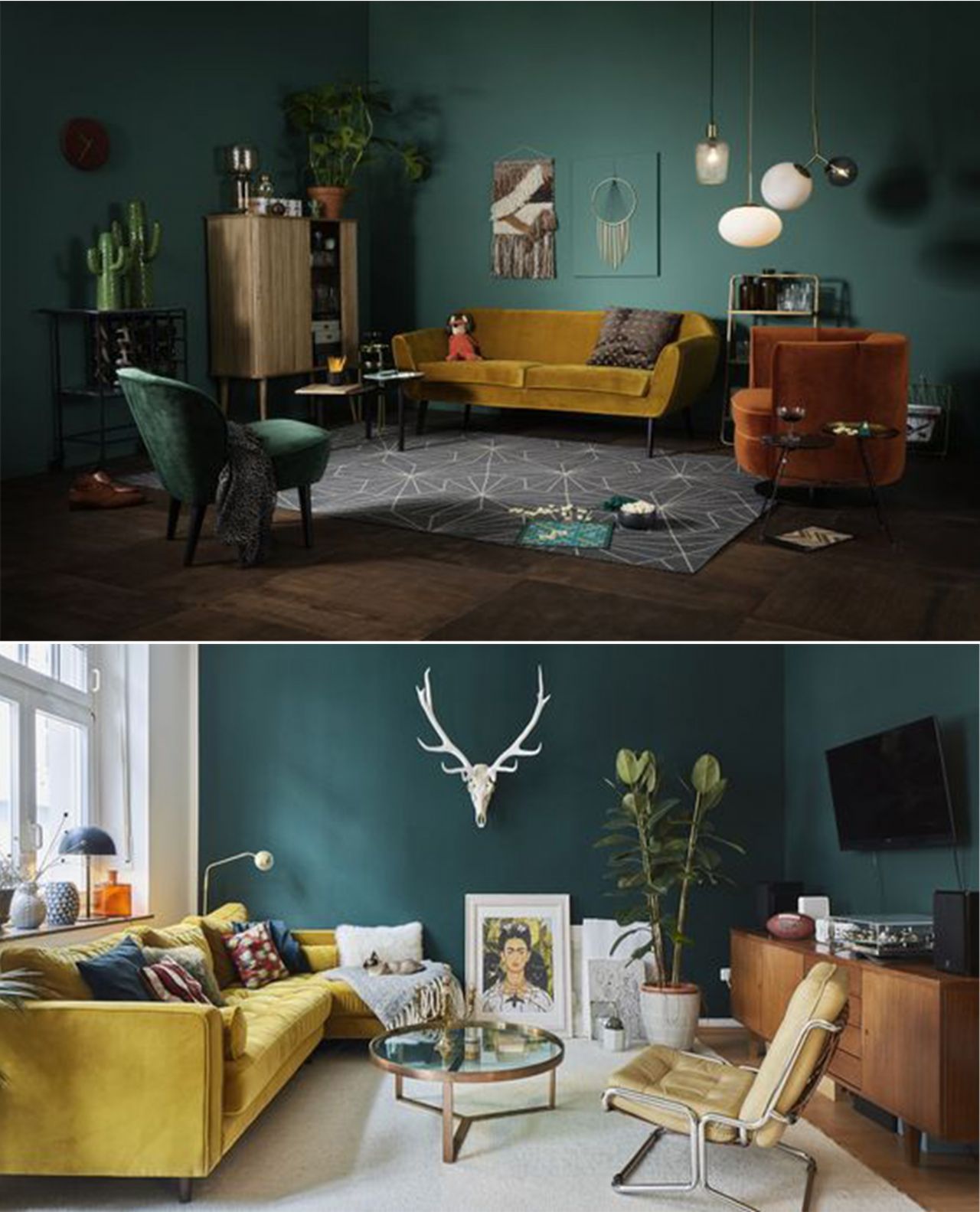
Image Credits: Pinterest | Pinterest
Look#4 Lustrous & Industrial
Gray will inspire you; take cues from industrial spaces, like train stations, lofts, and factories. incorporate that with metal and natural materials like concrete and stone—but do it a tad bit differently.
Gray feels characteristically urbane and industrial, and it leans slightly masculine with its shadowy hues. Since it is ultra-saturated, use furniture and decor that would contrast with and soften the color. Add stone accents to feel organic, and shades of yellow or softer pinks or blue pops and tinges of natural materials to add a textural element. The little things make the space feel more gregarious.
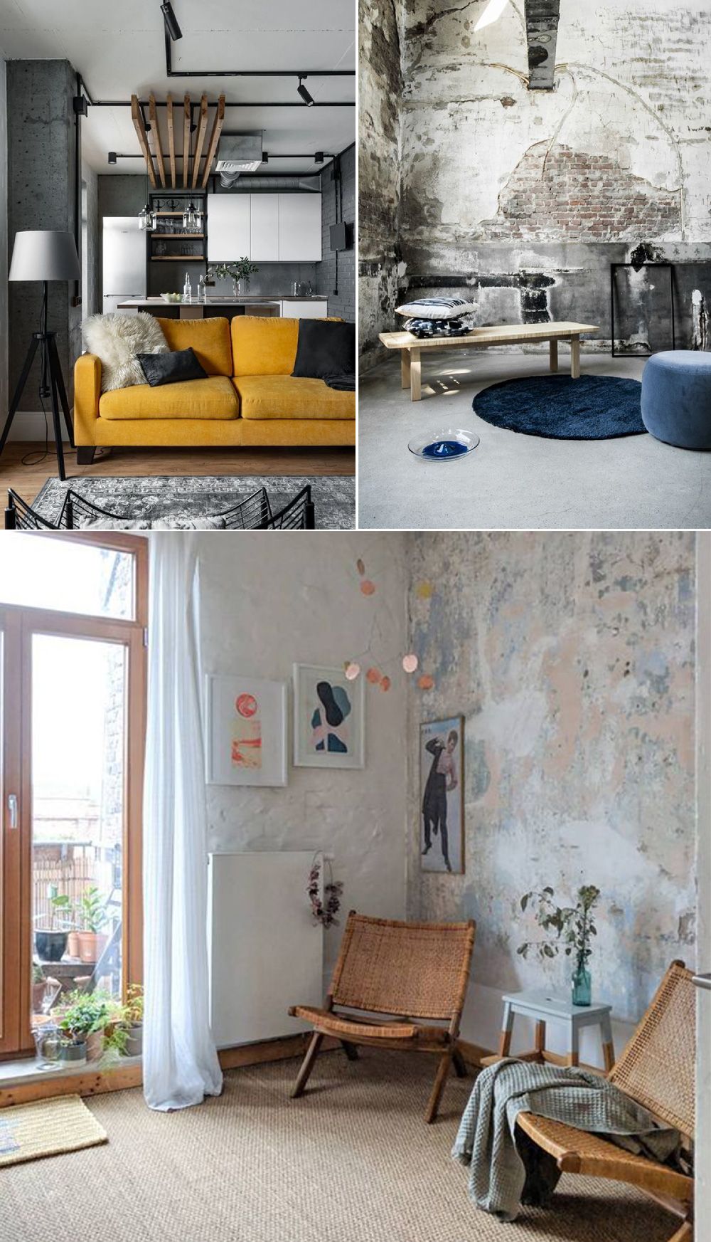
Image Credits: Pinterest | Pinterest
Look#5 Calming & Understated
It has undertones of warmth, making it an excellent color choice for any style.
Ultimate the Gray up with lots of rich neutrals, like leather, deep brown wood, stark blacks and whites, and even some tans—embracing a neutral color palette, but creating a space with a ton of depth
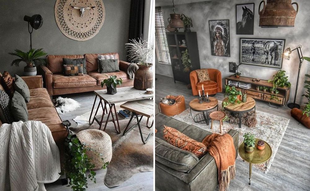
Image Credits: Pinterest | Pinterest
While we pursue comfort in the familiar. As an antidote to the whole uncertainty, there is a growing need for small moments of mindfulness and bliss at home. People are turning to color to help them create a more uplifting environment and keep anxieties and pressure at bay. Color is used as a therapy to encourage optimism and healing, but also as a tool for self-expression and storytelling. And these two colors will walk right in to the heart of our homes!
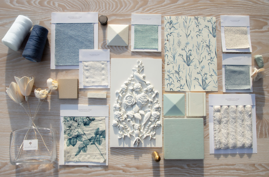
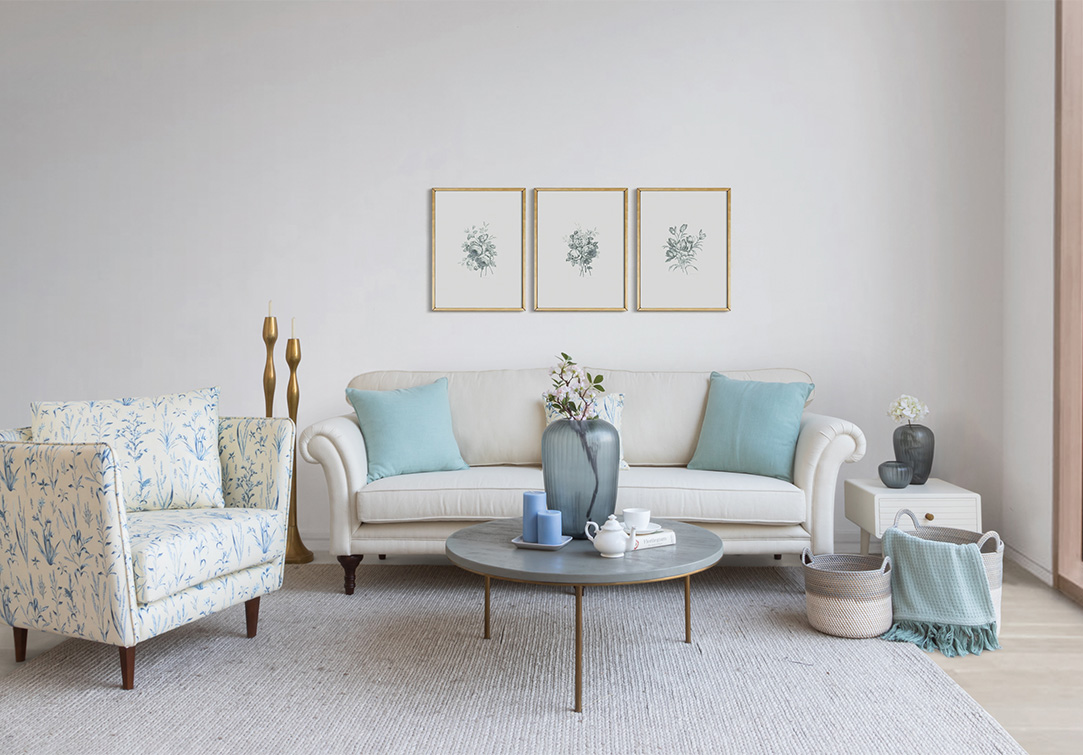
Quaint aesthetic, authentic design and warmly indicted interiors selecting endless inspiration for your home on www.gulmoharlane.com
 Categories
-

-
 April 18th, 2026
 -
 April 11th, 2026
 -
 April 9th, 2026
 -
A Season in Bloom: Introducing the Summer Bougainvilleas Collection
March 23rd, 2026