Blog
For the Stillness in the Anarchy ~ Pantone of the Year 2020
A new year brings new hope and new beginnings. And also brings the most anticipated announcement of the design and creative communities: Pantone’s Color of the Year. This year the color selected by the Pantone Institute is inspired by the calming seas and delightfully blue skies. And promises of a lasting refuge. The Color of 2020, Pantone 19-4052 Classic Blue - a solid hue one can always rely on!
Pitched somewhere in-between the mid sea blues and the falling ink of a dusky sky, this hue moves away from the strictures and conformity of the darker shades and is just short of the joys of simplicity, like in a child's paint box ~ the blue shade!

Image Credits: pantone
While technology races ahead, the Classic Blue will gravitate toward us nature and bring in a sense of peace, clarity and even fortification. And we are excited to create with the Pantone Color of year. Let’s see how…
BLUE IS THE NEW BLACK. AND WHITE
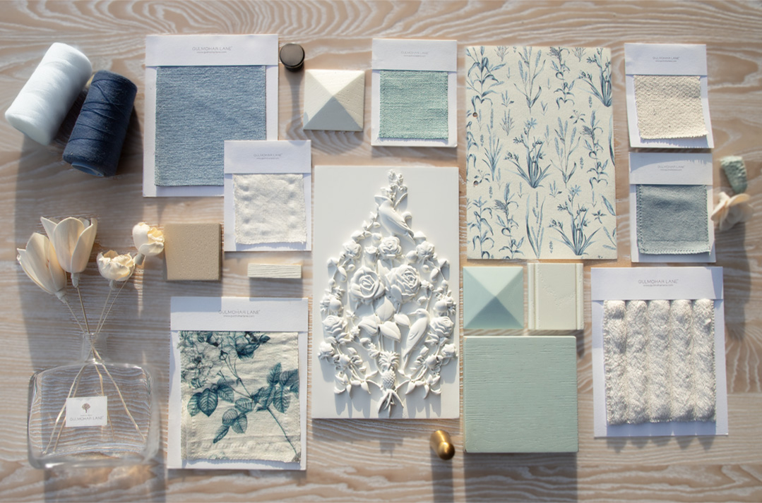
See around and find shades of this tint and then find plenty of beautiful inspirations. It is easy to say blue, but which blue? The Classic Blue is indeed easiest to find and to flourish your homes with timeless elegance and simplicity. We have put together some interesting looks inspired by the Color of the Year that will add an enduring kick of style.
Too much blue is never too much, we say!
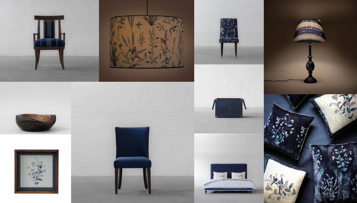
A SOOTHING LIVING ROOM
Find soothing Zen take-over your home with our Sofas and Armchairs. They offer a pop of color and are an absolute glam statement for living rooms. Combine these with accessories like cushions, throws, vases, lamps and more! Find a regal sweep-in with the versatile hues of white or humble greys or may be indulge in a mix-match of a blue sofa and a printed accent! The choices are endless with this beautiful color.
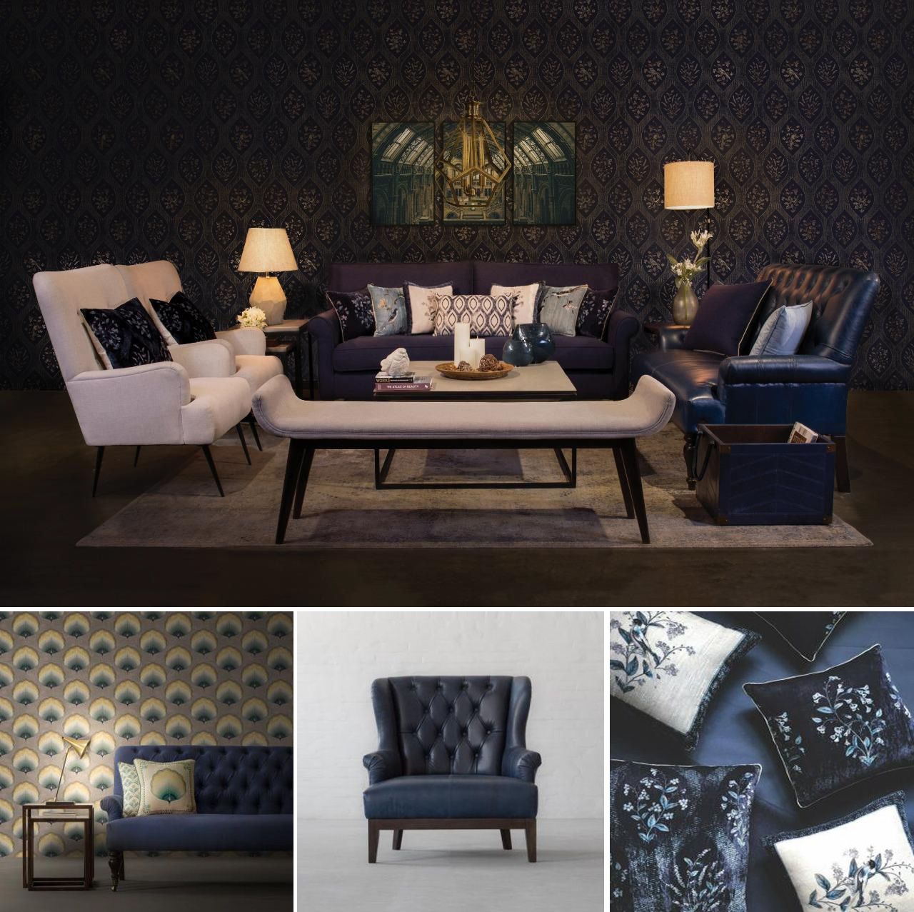
Image Credits: Gulmoharlane
A PEACEFUL RETREAT – A BLUE DORM
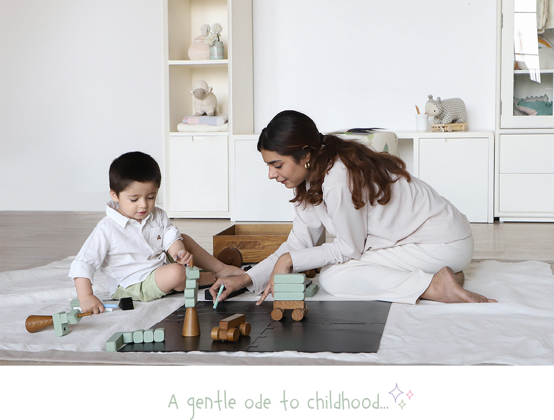
Evocative of peace, harmony and everything soothing, let’s celebrate the calming effects of shades of blue in our bedrooms. Combining the quintessential hues of brown and grey along with the thoughtful and meditative lighter blues or peaches, beach sand as accessories to go with the pantone colour of the year. It is sure to counter your urban chaos with tranquil vibes and create a peaceful retreat for you.
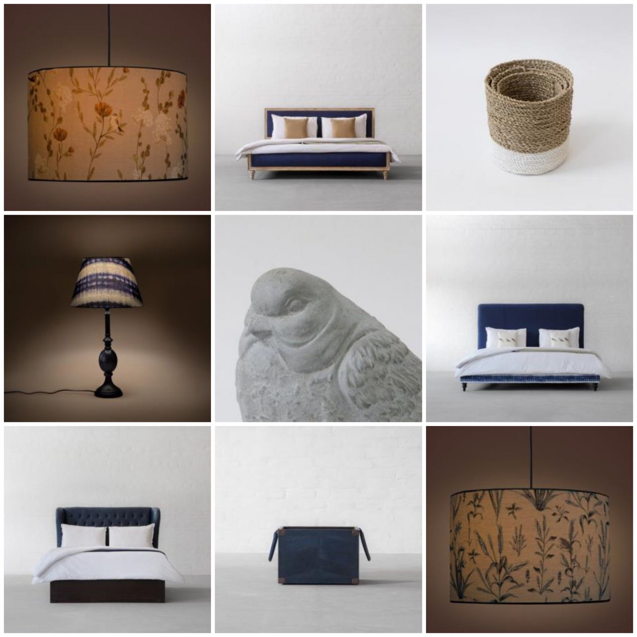
Image Credits: Gulmoharlane
IRIDESCENT TWILIGHT - AZURE DINING CHAIRS
Unwrapping the glowing version of classic blue in the dining area will remind you of a twinkling evening sky. With use of golden, chrome and grey as the chief accent colours for the table and classic blues for the chairs, to create a well-designed backdrop also add its contrasting counterparts like natural rattan and darker hues as accessories. Together they will reflect a sophisticated palette painted across the sky, adding illumination just like Vegas twilight!
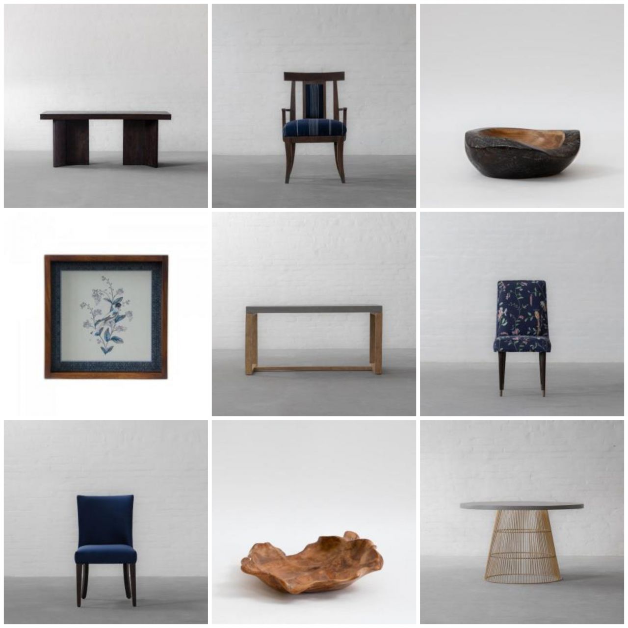
Image Credits: Gulmoharlane
Characterized as redolent of calmness and restful sleep while also offering the spirit of hopefulness, it is a precious hue in a twitchy world. Now whether it’s your living room, your bedroom, your dining or even your bathroom, classic blue can lay a robust base that can set the stage for unique combinations and fun colour mixes, to create surprisingly earthy and opulent interior styling statements.
So, how will 2020’s Pantone colour reflect in your humble abodes? Share your precious thoughts in the comments section below and keep following this space for more décor inspiration.
 Categories
-

GL Gifting Collection: Thoughtful Gifts for the Festive Season
July 24th, 2026 -

Monsoon Stillness — Styling the Home for the Seasons Quiet Hours
July 21st, 2026 -

-
 April 18th, 2026
 -
 April 11th, 2026