Blog
What are the Spring Colours, After all?
“We are all a little broken. But last time I checked, broken crayons still colour the same.” - Trent Shelton
Colours truly can lift our spirits and in #pause times like these, we tend to look at opportunities to bask in the sun once again. But instead of stepping out, bring in the colours of nature surrounding us right now - the happy ‘spring’ colours. And as quoted by the executive director of Pantone, ”Spring 2020's colour palette infuses heritage and tradition with a colorful youthful update that creates strong multi-colored combinations as well as energizing and optimistic pairings.”
From corals to variations of classic blues, sage to unexpected shades of yellow, we are sharing our favourite spring colours that you can use to decorate your home while staying indoors.
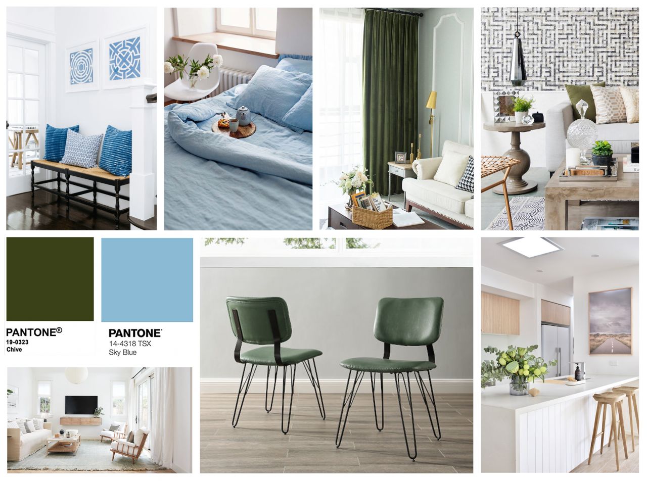
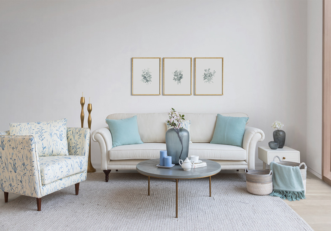
SKY BLUE REFRESH
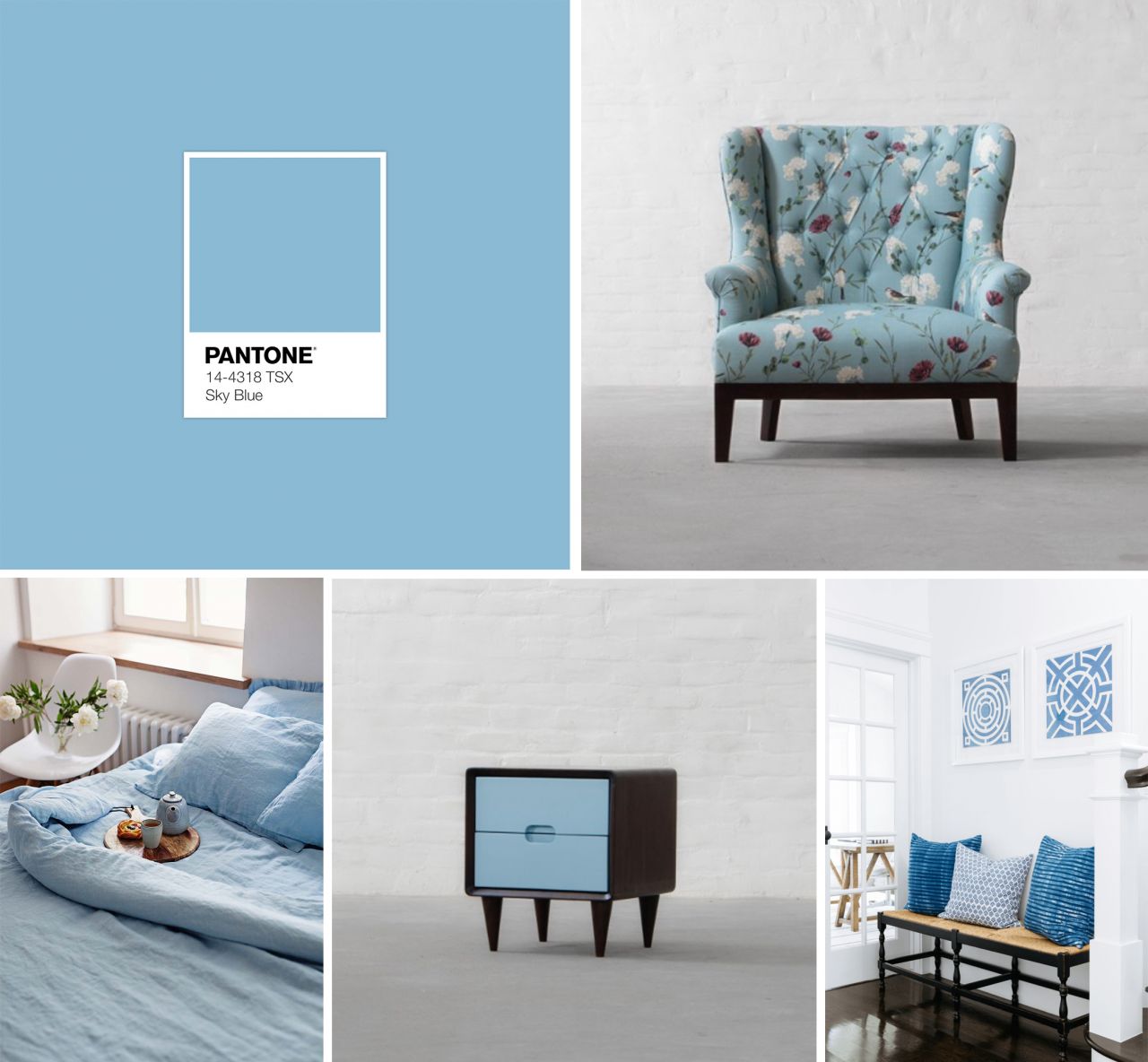
Image Credits: Gulmohar Lane | Iconic Linen | Gulmohar Lane | Rita Chan Interiors
With classic blue selected as the pantone colour of the year, it is only but fair for sky blue to make it to the spring palette. This shade of blue is as cheerful and as refreshing as can be and would work perfectly on accent cushions, printed upholstery or even a corner flower arrangement. You can also take a cue from our Nottingham Side Table and use highlights on furniture to make a true sky blue statement.
CORAL DREAM
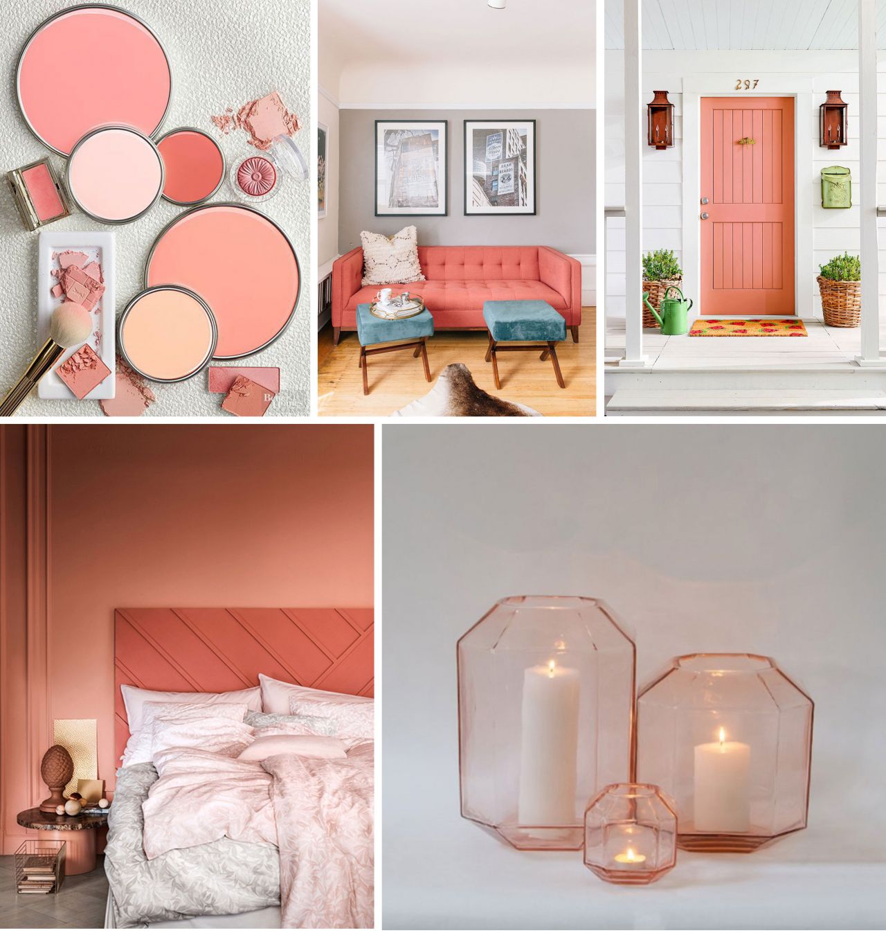
Image Credits: Better Homes & Gardens | The Everygirl | Country Living | Italian Bark | Gulmohar Lane
Last year’s pantone colour has left its vibrant effects even this year, as coral, both invigorating and energizing tends to add a dash of happiness wherever you put it. Combining the warmth of orange with the delicacy of pink, this hue is perfect to create both casual and ultra glam affairs. This shade can almost be used anywhere in your interiors but try making it a statement as a wallpaper or as a living room upholstered couch.
SUNKISSED SAFFRON
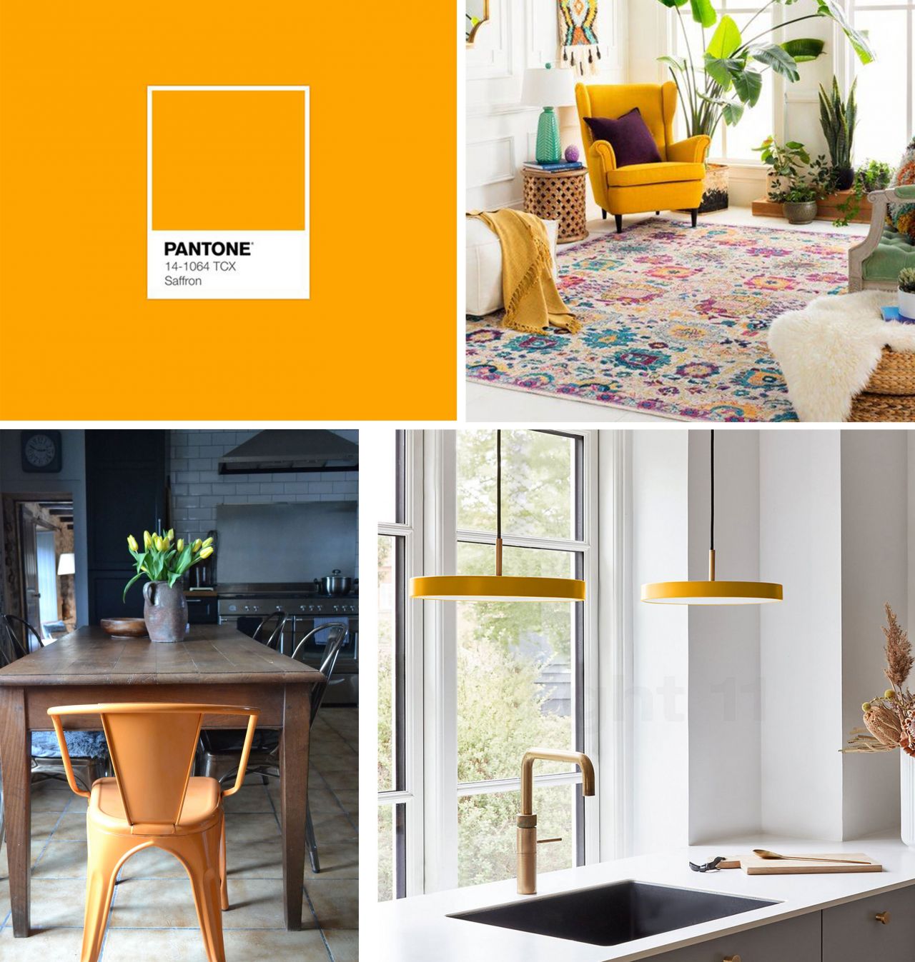
Image Credits: Boutique Rugs | Istome | Pinterest
The flavourful zesty palette in its various hues and tints is a must for every spring till eternity and this year it’s all about its vivid and bolder version. A keen mix of orange and yellow, saffron is an optimistic pick, something that will help you add brighter and lively tones back into your home after the cold & dark winter months. Incorporate this hue in small doses using tinted glass accessories, accent lighting, a pair of ottoman or end dining chairs.
DARING CHIVE
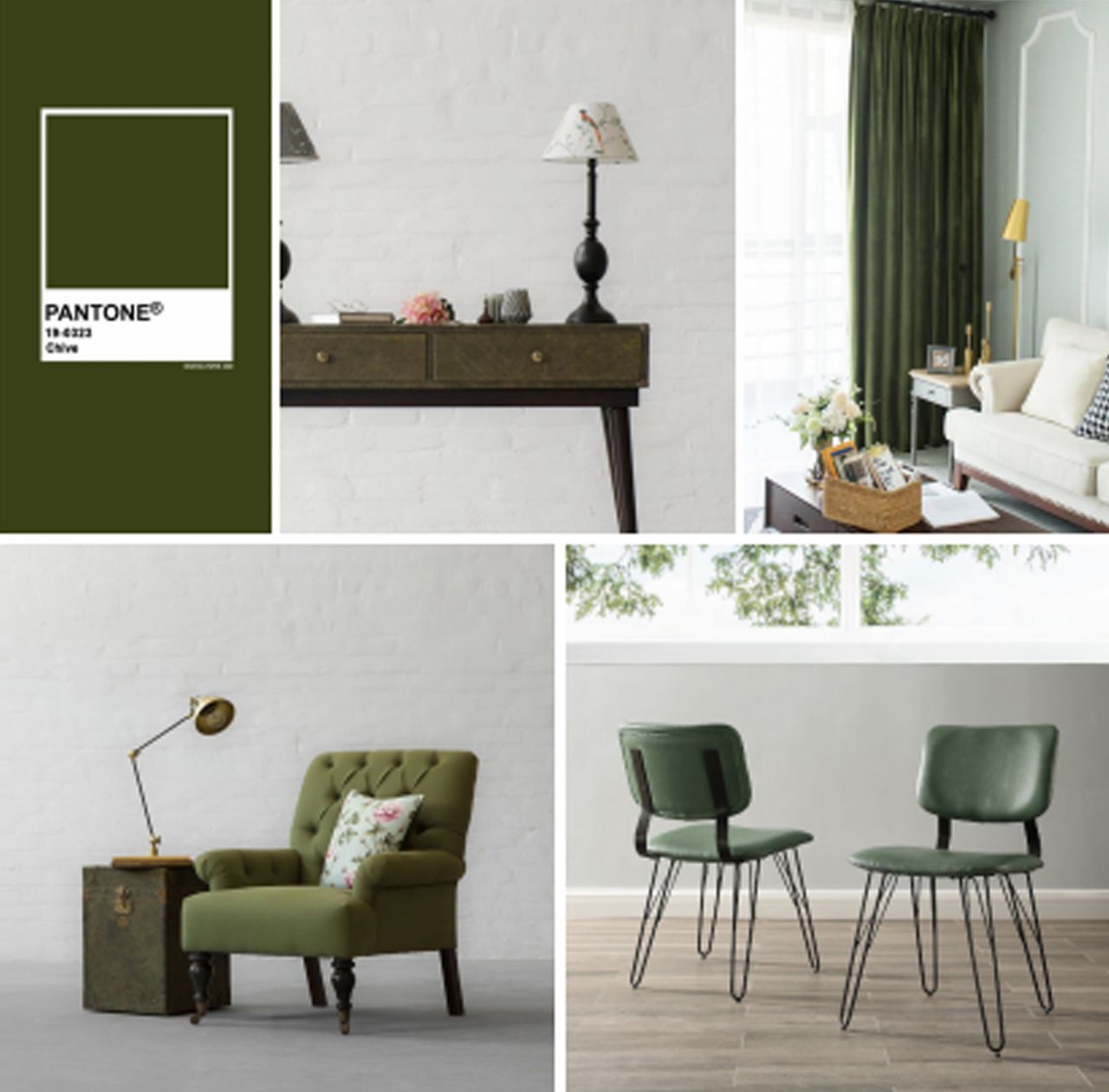
Image Credits: Gulmohar Lane | Etsy | Gulmohar Lane | Bellacor
Catching your eye with its cool and glamourous undertones, chive is much darker, richer and herbaceous shade from the green family. Acting as an almost neutral hue, it can pair beautifully with a plethora of colours especially the ones discussed above. Just because it is from the darker side of the colour wheel doesn't mean it can't be brightened up for spring. Pair this transitioning hue with lots of indoor plants for a serious celebration of spring. Give it a go in your living room, your study room and your bar counter in the form of luxurious upholstered leather.
FLAWLESS WHITE
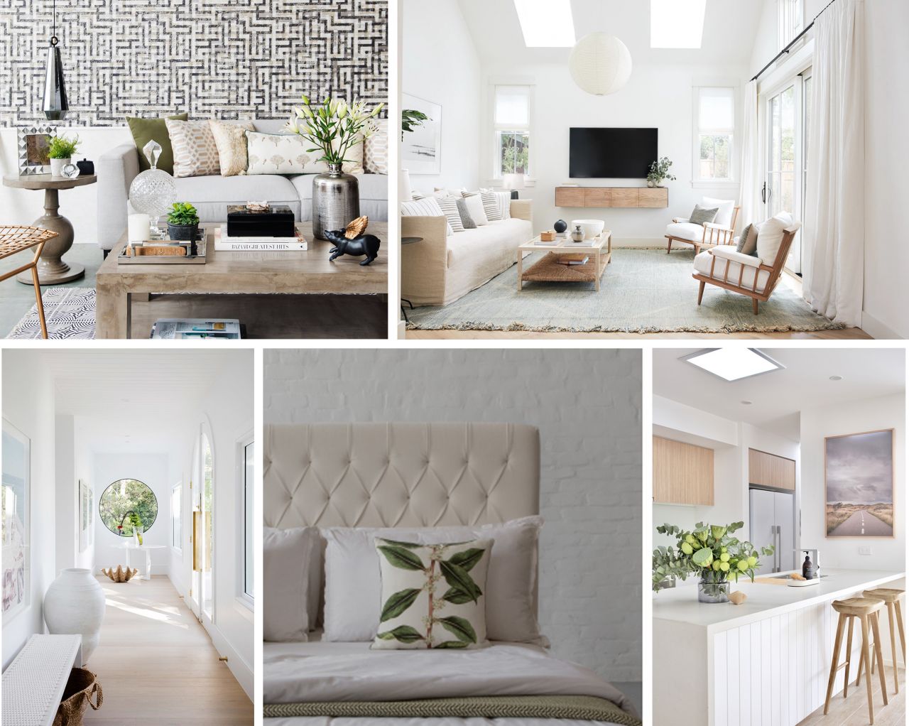
Image Credits: Beautiful Homes | Lark & Linen | Three Birds Renovations | Gulmohar Lane | Style Curator
A spring or a summer look will always feel incomplete without infusing heavy doses of white and light neutrals including mushroom hues. These hues not only transition us into the warmer mood but they also let textures and patterns shine on their bright personalities, making them ideal to be used on a number of surfaces from walls to upholstery to chinaware to even your furniture finishes. Another foolproof way to brighten up your home for spring is to go all-white - think airy elements like sheer curtains, white linens and transparent glass accessories.
Now that the secrets are out, go on and get creative with these happy chirpy hues that will help you spring into spring!
 Categories
-

-
 April 18th, 2026
 -
 April 11th, 2026
 -
 April 9th, 2026
 -
A Season in Bloom: Introducing the Summer Bougainvilleas Collection
March 23rd, 2026