Blog
A Home of Stories | Print Life
Just in time for the sunny summers melting into the moody monsoons, it’s finally time to talk about our favourite home décor idea, Prints! Prints and patterns can add dimension and infuse personality in a space; they have an exotic and travelled feel that’s also a bit playful, making them a great tool for layering. These wonders can take your living room or your personal space away from a monochromatic eyesore and can make them pop effortlessly.
But how can a minimalist use prints? How can you layer print on print? Which print will go with what? We bet these questions are rushing on your mind and with our little insider knowledge you can easily envision your space as a meadow of blossoming flowers and invigorating lines...
Let’s go!
THE CHOICE - Flora or Fauna
Whether you like romancing with the forest or showcasing your innate love for animals, making this choice is fairly easy. All you got to do is listen to your heart and enjoy the happy, poppy patterns (of your choice) in your home all year long. While botanical and floral prints are fresh and rejuvenating, fauna or bird prints can really enliven an otherwise neutral palette.
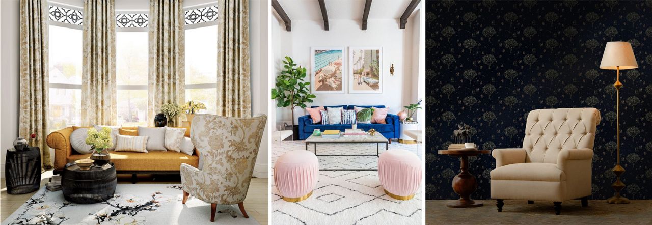
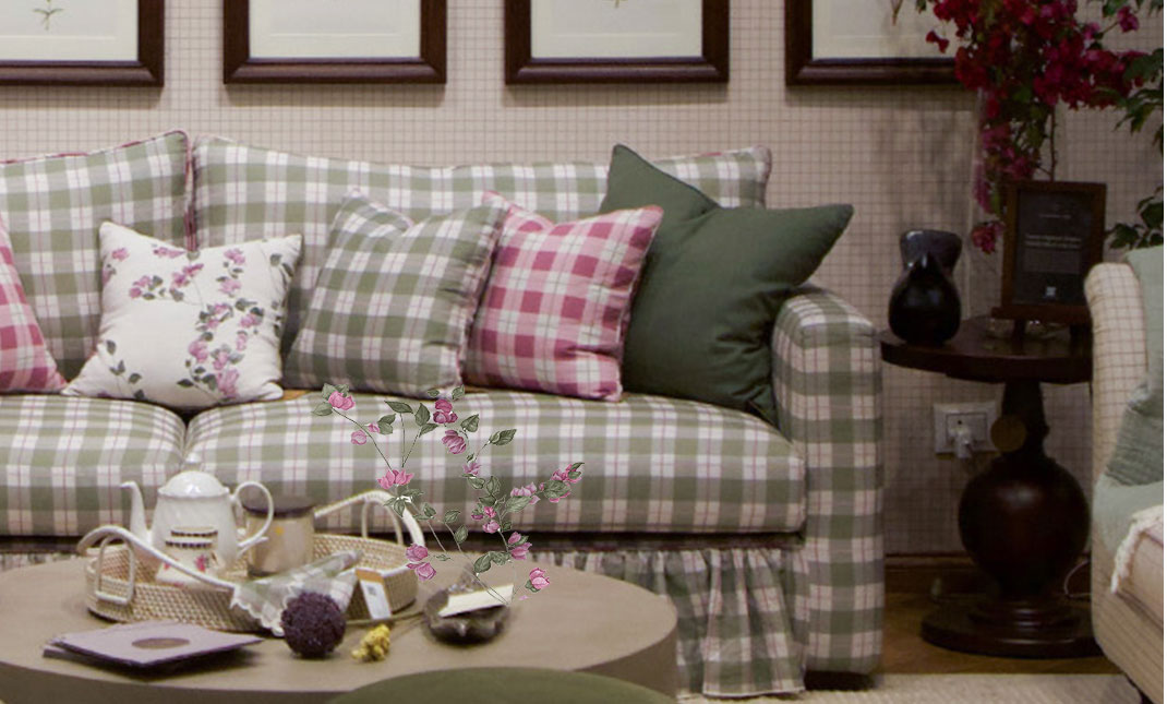
A Mix Bunch of Flora and Fauna prints
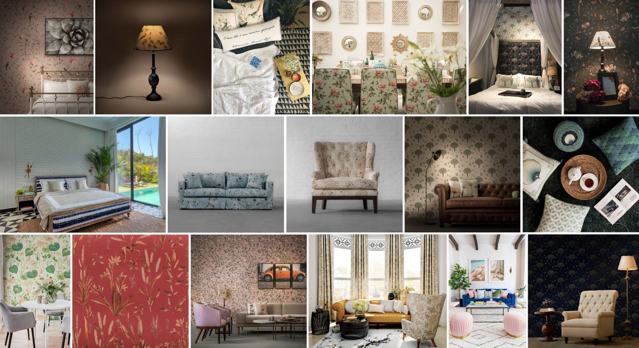
Even the most mild-mannered person can benefit from an occasional walk on the wild side. Whether gracing an all-white bedroom or a rustic living room, animal and bird prints, from the peacocks to the nightingales, make a big impact in spaces where their appearance is least expected. An important point to consider with such prints is that one animal print object (whether a wallpaper, a set of ottoman, a sofa or a rug) is the key to success, as it will act as an accent that is a part of the entire story told in a space and not the entire focus of the room. With fauna prints, less is always more! Also if you are a minimalist, opt for accent accessories, like cushions, table lamps, throws etc., as this way you can spice up your space without having to completely rework your vision.
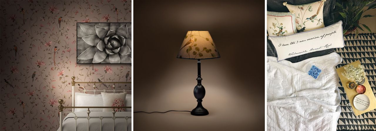
Impactful yet not overpowering, this is what dreams are made of! | Making your days brighter with its soft glow and exotic print. | The cushions are elements of life amidst the urban turmoil...
Image Credits: Gulmoharlane | Gulmoharlane | Instagram@lapetitchef
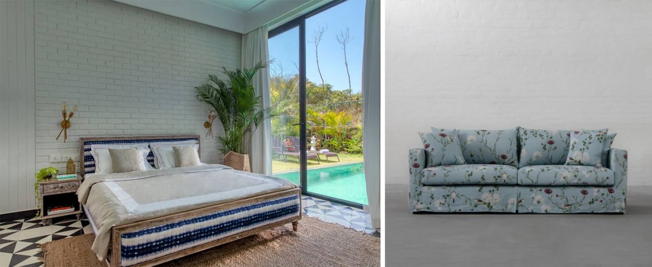
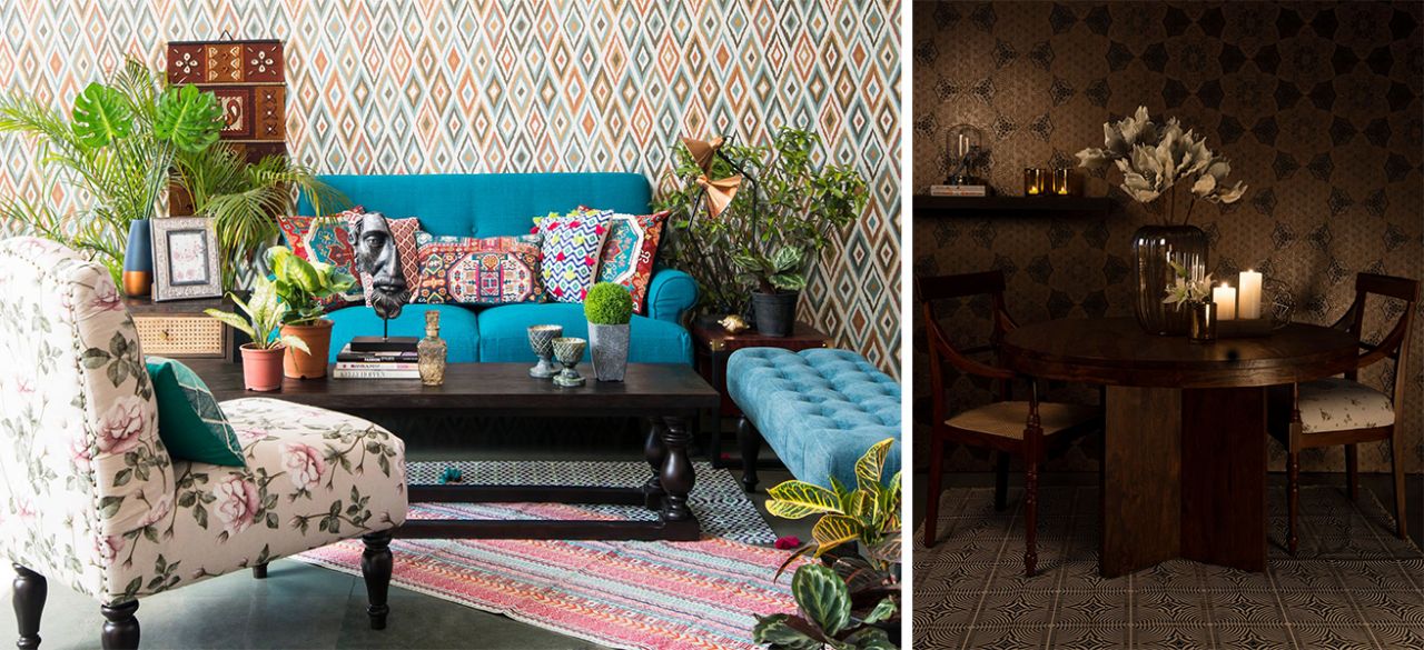
Ranging from dark and dramatic to light and fresh, botanical and floral prints are an easy way to add plants and blooms to your interiors, without having to worry about taking care of them. There's a certain forget-me-not charm about the faded florals, they remind you of times gone by (at your grandparent’s home) and make for perfect companions at the breakfast table. On the contrary, a buoyant floral print can serve as an enveloping focal point for your spaces. It is important to avoid creating an overwhelming space with nature prints, so either use scattered and small-scale motifs, otherwise tone them down by solid colours.
It feels like dining amidst the blooming nature spreading its vintage wings... | Extending the summer haze to the walls and the cushions and to the blissful nights...
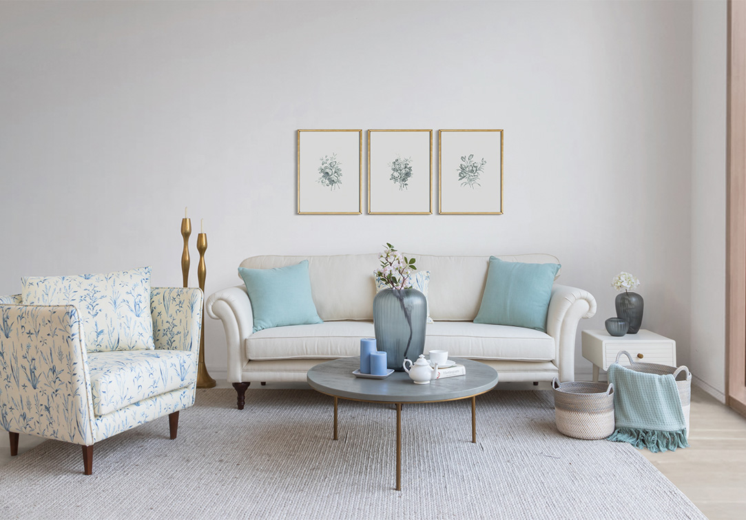
THE MOOD & THE HUES - Beachy, Earthy or Spring-like
Well, we can't all own a beach house, or a countryside cottage or a forest cabin, but we can bring their little charm to our homes wherever they are! Dress up your home in prints and hues that reflect either your local surroundings or your dream locations, for example a nautical décor should have prints in hues of blues, greys and whites, while that of a countryside home should be a mix of browns, beiges, olives and muted reds.
With a little motion and some hints from the ocean, you can capture your coastal style effortlessly. Blue’s calming effect makes it a natural fit for beach houses, but it’s not this one hue that fits all. Yes, you can make a bright, statement-making print work in a sophisticated and soothing space but it should be balanced with solid expressions of deeper or lighter blues (contrasting with your print) or the timeless whites.
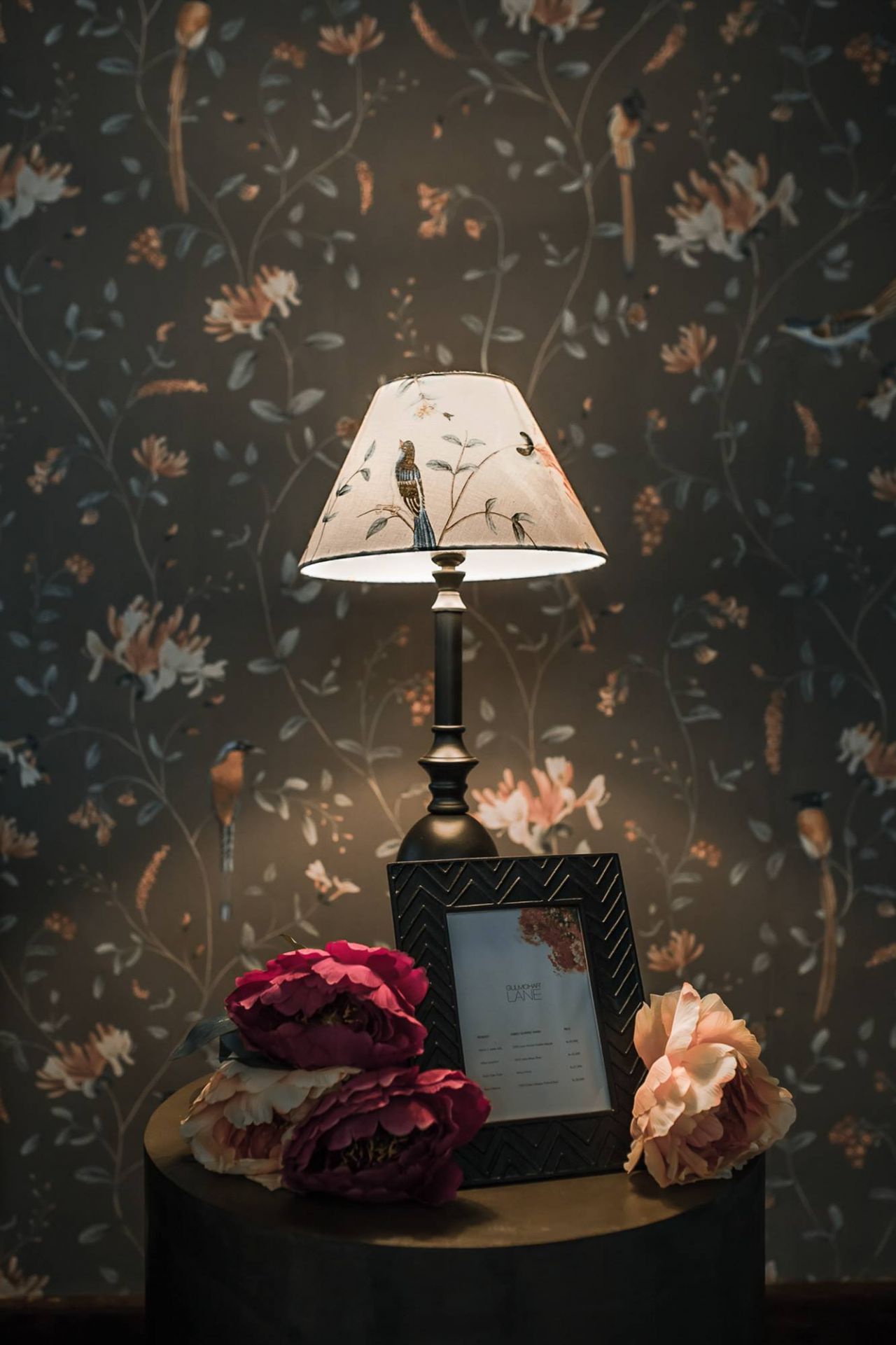
The rhythm and symphony of our ‘Moonriver print’ is a match made in heaven for this Goan Holiday Villa! | The sofa skirt, the ocean hues and the bountiful nature - a nautical décor checklist!
Image Credits: Instagram@Vianaargoa | Gulmoharlane
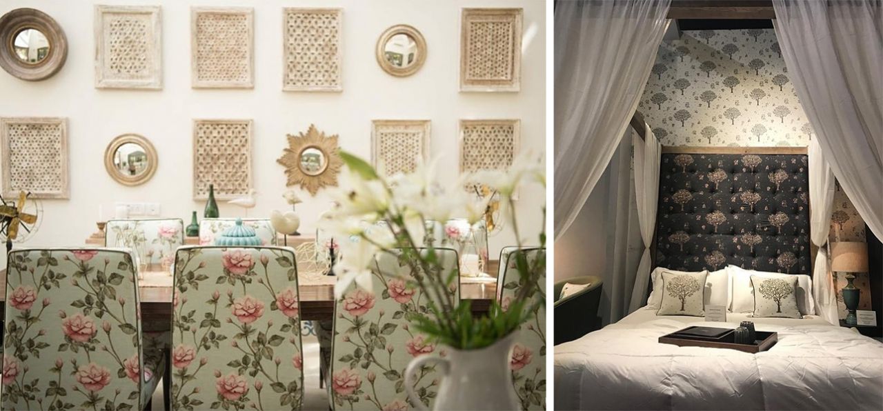
An ode to the rustic, raw and untamed nature, an earthy countryside décor invites the outdoor into your home. Easy-to-live-with colours such as tans, whites, olives and reddish browns combined with intricately designed and natural patterns can strike a calm note in your personal spaces. Count on a medley of materials and patterns to inject instant coziness. For example a textured printed wallpaper, combined with woven patterned upholstery and framed artwork on the wall can create an eye-catching appeal at every turn while still looking serene and earthy.
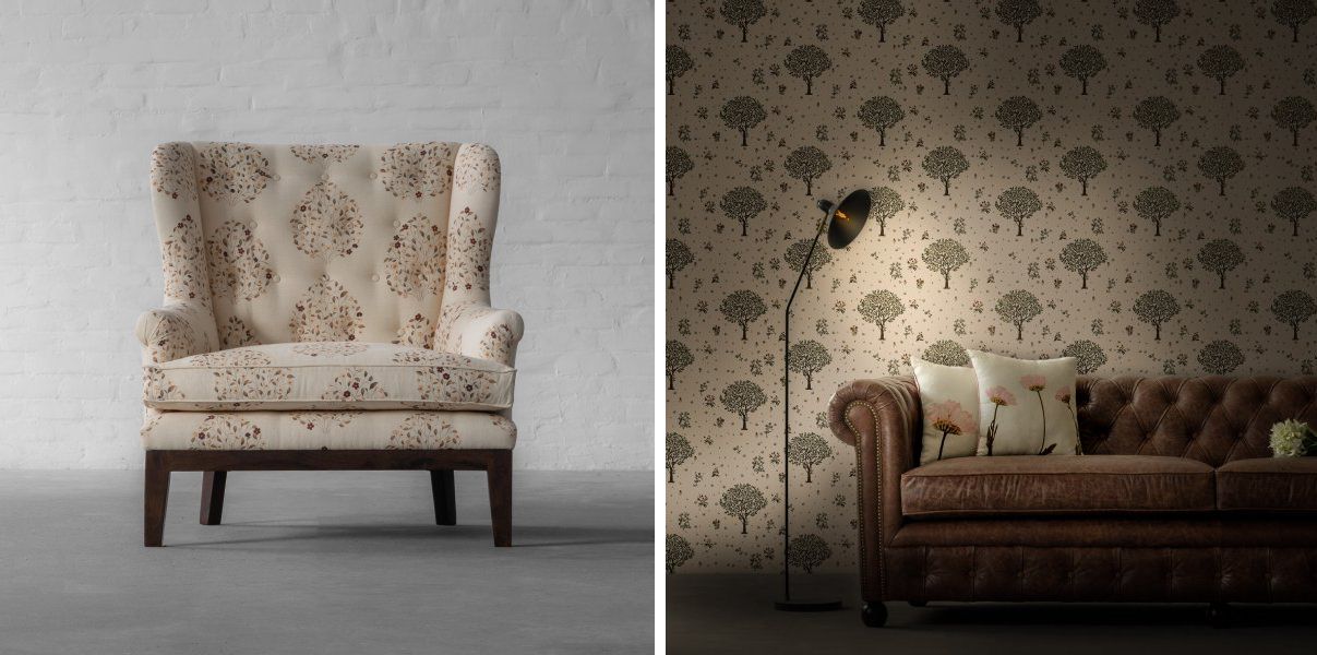
A humble king’s seating! | The woods come alive in our ‘Signature Print’ setting.
Image Credits: Gulmoharlane | Gulmoharlane
From the beaches to the untamed wilderness, we now move on to a more refreshing and colourful décor idea, an ode to the blooming nature, the springtime. Taking cue, again from the nature, this style plays with fresher greens, brighter reds and flora and fauna (blooming) prints. In this décor theme, you can add the prints inspired from the colourful spring flowers, the green grass and the highlands - just like a perfect forest cabin. Using prints in smaller scale work the best with such a look. Think more of wallpapers and single motif cushion covers, while keeping the rest of the décor solid hued or lightly textured.
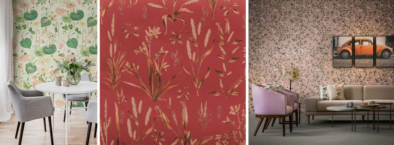
The visuals of a spring garden as observed during an entire day. | The endless fields shining under the hues of a dusk sky... | A Pastel Vintage Romance, right out of a film set!
Image Credits: Rebelwalls | Gulmoharlane | Gulmoharlane
THE EXPANSE - Furniture, Furnishings or Walls
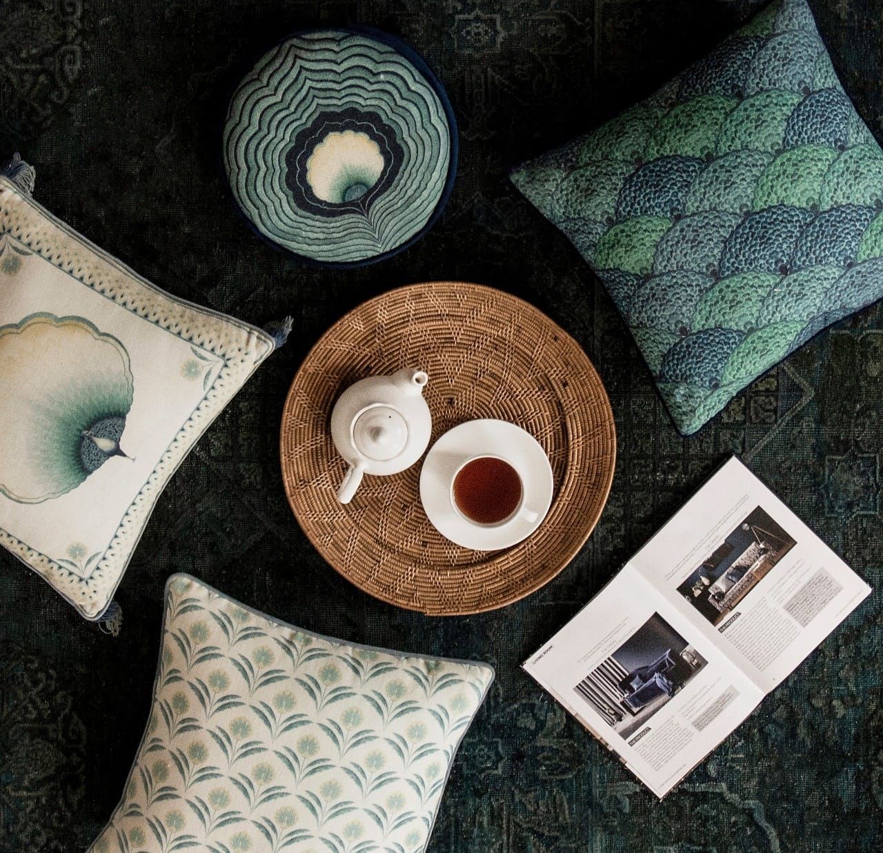
Once you are sorted with the type and the hue of print, the next in line lies its usage. The location where a print is used greatly affects its impact and the mood. The most prominent pattern in the room is typically adorned by a rug with motifs that set the tone for the rest of the space. After which, additional layers of complementary or contrasting patterns, in smaller sizes boost visual interest, like the prints on cushions, upholstery, curtains and walls.
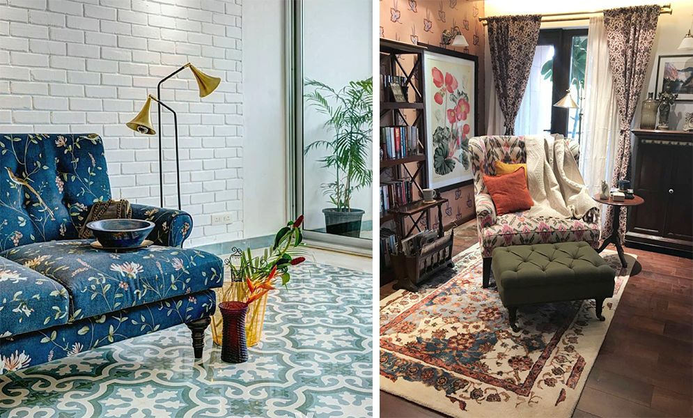
Pairing prints in similar hues can help you extend this trend on many surfaces, just like this setting. | An overdose of prints can still look well put, if you mix prints of different sizes yet similar undertones.
Image Credits: Instagram@Vianaargoa | Instagram@vdwthefilm
If you believe in minimal magic, then opt for prints in neutral hues (on the walls) and prints that have monotonic colours (on the sofa), just enough to break the monotony of solids. But if boho-chic is your go-to-look, then you can pack every shade of the rainbow to create a little slice of bohemian paradise. While your sofas can adorn stripes or geometric patterns, your accent armchairs can flaunt abstract floral prints and your walls can be filled with mainstream florals and botanicals. While mixing and matching is easier to describe in words, it is pretty complex to achieve, here are some looks that can inspire and help you.
Sunshine in a frame - The abstract carpet and the floral print on the armchair and the curtain beautifully contrast and juxtapose with the amber hued sofa | Starting from the floor, this space takes the story up a notch to the cushions and the walls, mixing and matching different styles on the way (also giving a break with solid hued furniture) | A carpet in muted colour and tone-on-tone print gives a backdrop for the other print to shine, there are still 2 prints but they blend seamlessly...
Image Credits: maishaa | wayfair | Gulmoharlane Rug Credits: JaipurRugs
Luckily, with furniture and accessories you can command the overall look of the space - bold (with prints all over) or subtle (with prints only as accents). When it comes to mixing patterns it’s important to trust your own instincts about what looks good but there are some tried and tested tips that you can steal. Using atleast 3 patterns in a space in different scales can really amp up the look but remember to keep the intensity of the colours similar (for example you can mix pastel colours with beach hues, as both command freshness). Also, try putting prints throughout the room, instead of loading them all in a single space or a piece of furniture.
Here are two examples, to help explain the looks better.
Both of these looks use atleast 3 different patterns, but still look put-together. The walls, the floors and an accent are just the right amount you can opt for!
Image Credits: beautifulhomes | beautifulhomes
In such a look, you can just go for wallpaper and an accessory (table lamp in this case) for a toned down look, yet appearing thoughtfully styled!
Image Credits: theprojectcafegoa
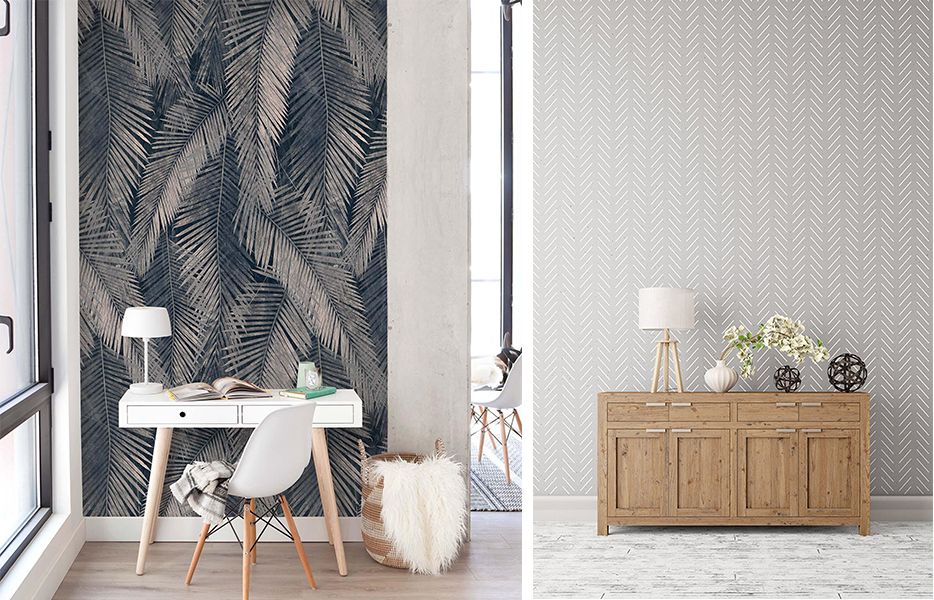
THE SCALE - Large or Small
Dramatic or subtle - prints are mostly defined by their scale. Large prints are usually used in small quantities but they create an exaggerated and dramatic look; on the other hand smaller prints can be scattered all around the house and might still disguise themselves as new-age neutrals.
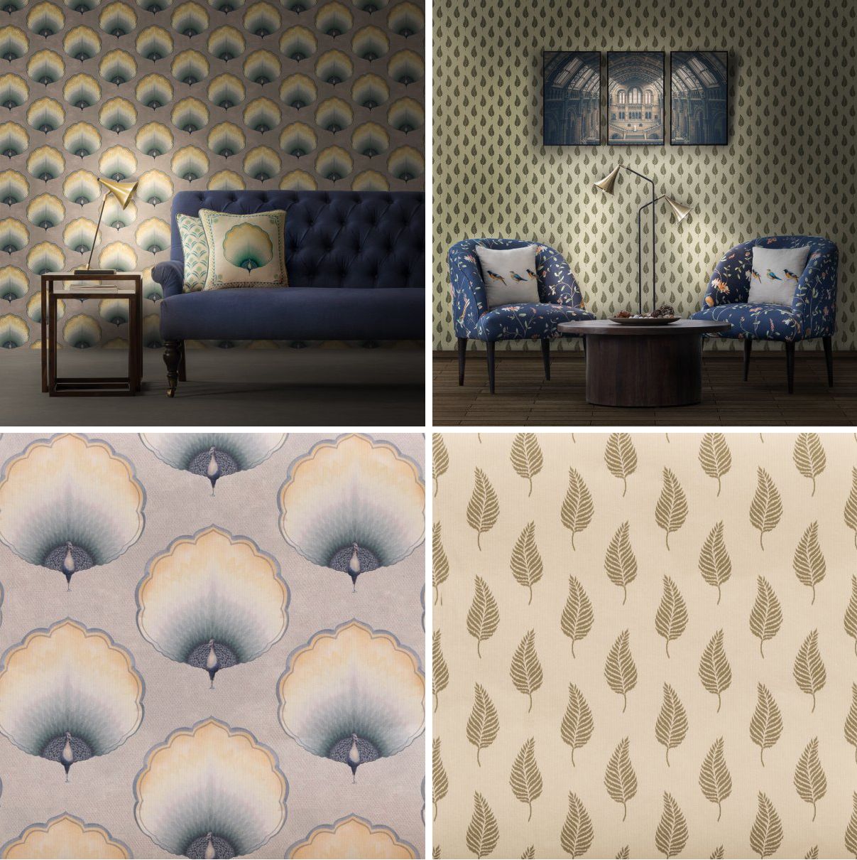
Dramatic wallpaper with Large Scale Print v/s Seamlessly blending wallpaper with Small Scale Print
Image Credits: Gulmoharlane | Gulmoharlane
For example, a cluster of cushions on your sofa can feel eclectic yet intentional, if each cushion has a different (small) print in a similar style. Or you can blow up a botanic print and place the artwork over your sofa or bed (or you can also divide the print into equal pieces, frame each piece separately and hang in a grid). The result will be an artistic space that will always kick off coffee table conversations. Moreover, a larger room can handle furnishings and décor that are larger in scale while the smaller ones must be decorated with more petite and delicate furnishings.
A bold accent wall with larger-than-life motifs can truly grab attention and be a showstopper | Wallpapers that are smaller in scale, let the furniture and accessory do the talking while still adding that ‘wow’ factor to your spaces
INSIDER TIP
No matter how much you love prints and patterns, remember to leave white space in a room. This is the space around and above your furniture. A room rarely looks good when every square inch of it is filled. The eye needs room to rest in a space, so provide it by leaving some surfaces uncovered and some walls alone.
Let each space, each element and each person tell its own story with prints and patterns that bring alive their character. For more such inspiration stories, keep following us and never stop experimenting, because only you can best design your space!
 Categories
-

-
 April 18th, 2026
 -
 April 11th, 2026
 -
 April 9th, 2026
 -
A Season in Bloom: Introducing the Summer Bougainvilleas Collection
March 23rd, 2026