Blog
THE QUIET POWER OF LIGHT BLUE: COLOR PSYCHOLOGY IN THE HOME
Some colors demand attention, and then some colors hold space. Light blue belongs to the latter. It doesn’t announce itself loudly, yet it transforms a room in ways that are deeply felt rather than immediately seen. In a home, where every element contributes to how we unwind, gather, and live, light blue works quietly—expanding, calming, and softening everything it touches.
WHY LIGHT BLUE FEELS EXPENSIVE AND CALMING
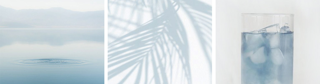
Light blue carries an inherent association with the sky and water—two of the most boundless elements in our natural world. Psychologically, this connection creates a sense of openness. Walls in light blue seem to recede, making spaces feel larger than they are. It’s not just a visual trick; it’s a perceptual shift. The mind reads light blue as breathable, airy, and unobstructed.
At the same time, light blue has a calming effect on the nervous system. Unlike more saturated tones, it doesn’t overstimulate. Instead, it lowers visual noise. This makes it particularly effective in environments where rest is
essential. The softness of the shade invites stillness—it encourages you to pause, exhale, and settle in.
There’s also a certain emotional neutrality to light blue. It doesn’t lean heavily into warmth or coolness in an aggressive way, which allows it to adapt to different moods throughout the day. Morning light makes it feel fresh and awakening; evening light turns it gentle and introspective.
ITS EFFECT IN WARMER CLIMATES LIKE INDIA
In warmer climates, where heat and brightness are constant companions, light blue becomes more than just an aesthetic choice—it becomes functional. It visually cools a space.
In Indian homes, where sunlight can be intense and temperatures often high, light blue counterbalances the warmth. It absorbs less visual heat compared to deeper or warmer tones, creating an environment that feels lighter and more comfortable. Even when the temperature remains the same, a room dressed in light blue can feel noticeably cooler.

This is particularly valuable in spaces that receive strong daylight. Instead of competing with the sun, light blue works with it. It diffuses harsh light, softening glare and creating a more even, soothing ambience. The result is a space that feels calm even at the height of summer.
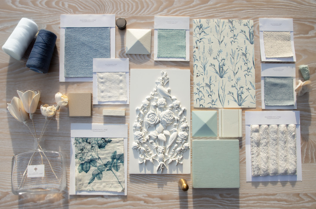
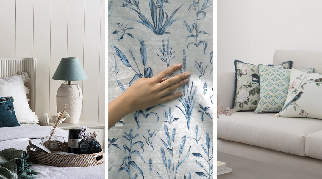
Light blue also pairs effortlessly with materials commonly found in Indian interiors—wood, cane, linen, and stone. Against these textures, it doesn’t overpower; it complements. It allows natural materials to stand out while quietly enhancing the overall mood of the room.
ROOMS THAT WELCOME LIGHT BLUE
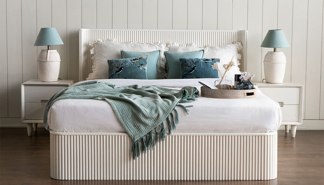
Bedrooms are perhaps the most intuitive place for light blue. Its calming qualities make it ideal for spaces dedicated to rest. Whether used on walls, upholstery, or soft furnishings, it creates a cocoon-like environment without feeling enclosed.
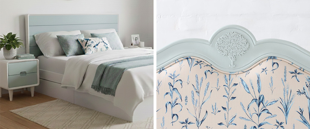
Light blue in a bedroom doesn’t just look serene—it supports better unwinding. It reduces visual stimulation, helping the mind transition from the busyness of the day to a slower, more restful state. Paired with soft textures and minimal contrasts, it can turn a bedroom into a true retreat.
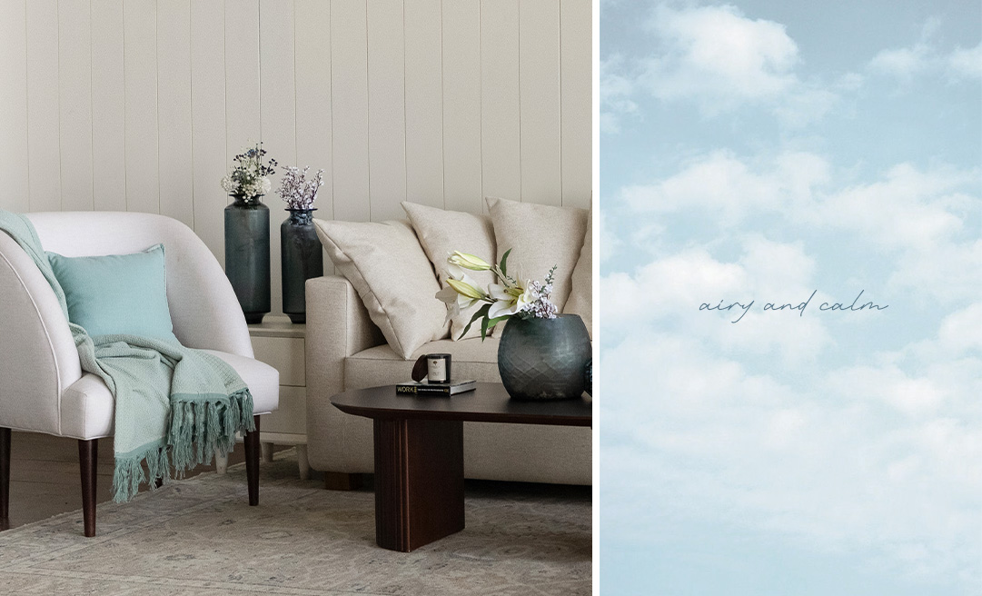
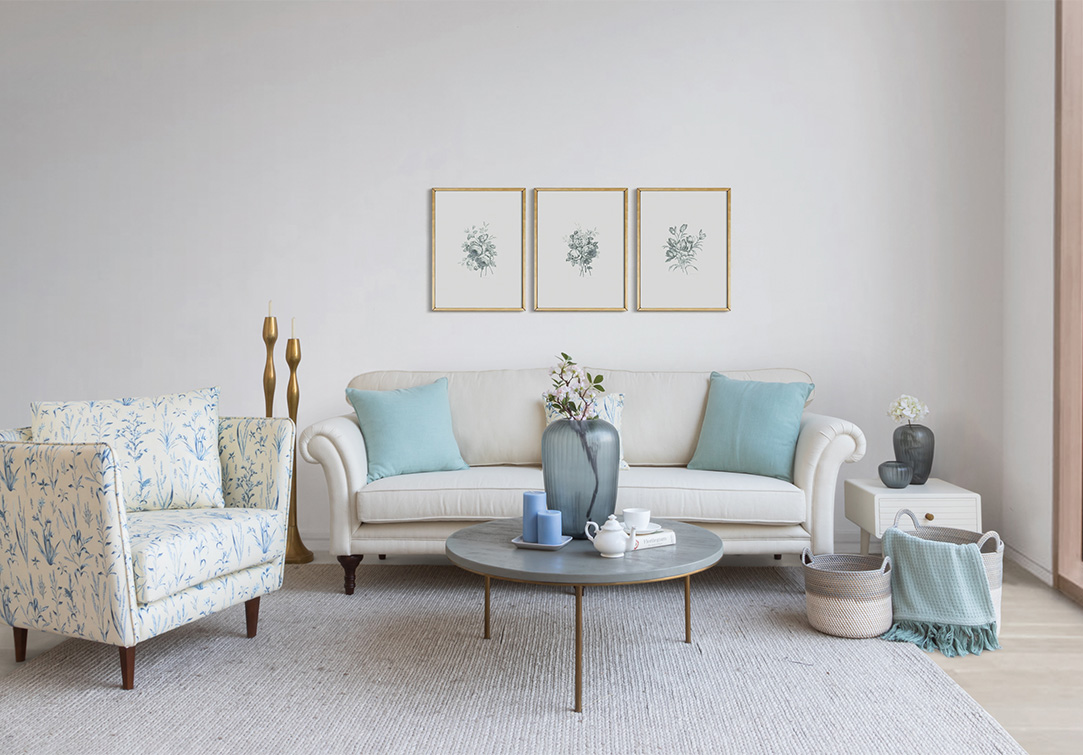
In living rooms, light blue strikes a delicate balance. It keeps the space feeling open and inviting while still offering enough character to anchor the design. Unlike darker tones that can make a room feel heavy, or brighter shades that might feel fleeting, light blue sits comfortably in between.
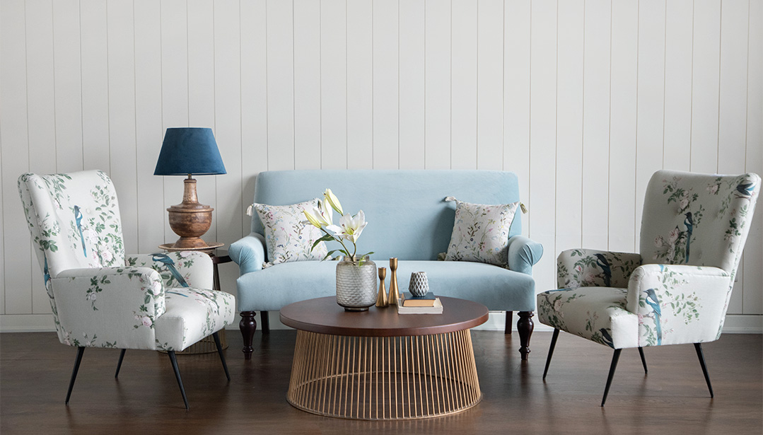
It works especially well in homes that are often host. The color encourages ease—it doesn’t dominate conversations or distract the eye. Instead, it creates a backdrop that allows people, textures, and moments to take center stage. When layered with neutrals, muted patterns, or even deeper blues, it can add dimension without overwhelming the space.
ENTRYWAYS
Hallways, entryways, and in-between spaces are often overlooked, yet they shape how a home is experienced. Light blue is particularly effective here because of its ability to make narrow or dim areas feel more open.
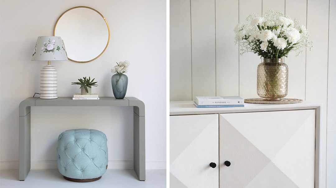
In transitional zones, it acts as a visual pause—a gentle reset between rooms. It connects spaces without creating abrupt shifts, allowing the home to feel cohesive and thoughtfully designed. Because these areas often lack natural light, the reflective quality of light blue helps bounce whatever light is available, subtly brightening the space.
A QUIET PRESENCE THAT LASTS
What makes light blue truly powerful is its longevity. It doesn’t tire easily. Trends may come and go, but light blue remains relevant because it responds to something fundamental in how we perceive comfort and space.
It is not a color that competes. It supports. It allows other elements—furniture, textures, personal objects—to shine while holding everything together with a sense of ease.
In a world that often feels loud and fast, light blue offers a different kind of luxury: calm that doesn’t need to be announced, and space that feels as expansive as it looks.

 Categories
-

GL Gifting Collection: Thoughtful Gifts for the Festive Season
July 24th, 2026 -

Monsoon Stillness — Styling the Home for the Seasons Quiet Hours
July 21st, 2026 -

-
 April 18th, 2026
 -
 April 9th, 2026